Usability
UX Research
Time:
12 Weeks
My Role:
UX Researcher
Methods:
Digital Analytics
Eye Tracking
Usability Testing
My Team’s process
1.Client Meetings
Kickoff and midpoint meetings
Utilizing eye tracking to reevaluate how students and teachers access Art History content on Smarthistory
The Client
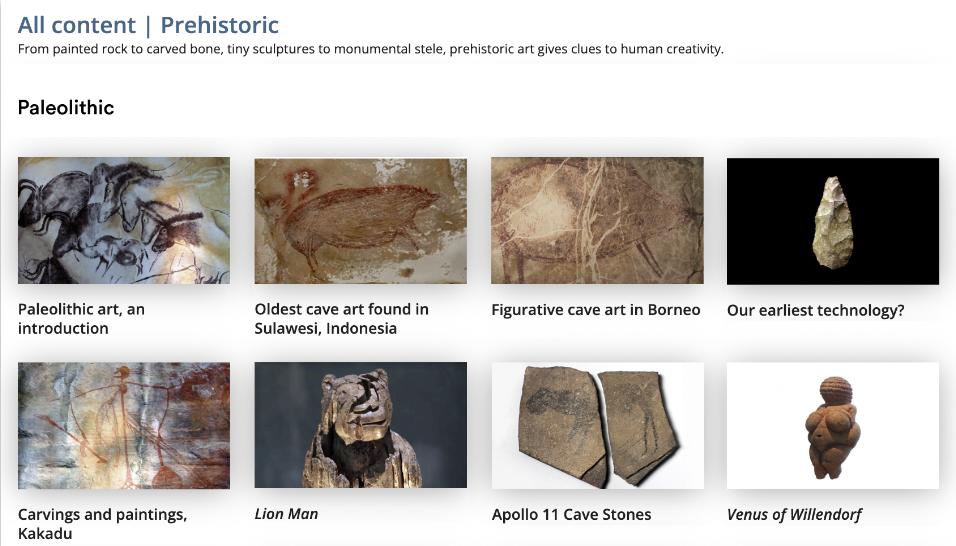
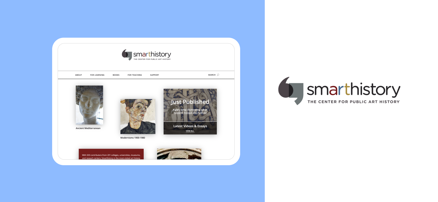
Smarthistory, a not-for-profit with support from academic contributors, has become the world's most visited art history resource. They are the official provider of art history for khanacademy.org and support AP and A-level art history and students, instructors, and lifelong learners everywhere. Smarthistory supports the ethical and open sharing of cultural knowledge. I worked with a team of 4 UX Researchers to identify how students and teachers navigate sourcing content on the Desktop site in the For learning prehistoric and Non European pages. We used Tobii eye-tracking technology, which detects a person's eye's presence, attention, focus, and position. From our testing and digital analytics, we identified opportunities for navigation improvement and content labeling.
2. Research Objectives
Define tasks after Behavioral Analytics insights
3. Testing Design
Preparing scripts, questionnaires and pilot testing
4. Participant Recruitment
Recruited participants with varying backgrounds in Art History
5. Hold Testing Sessions
Held 6 sessions and noted observations and user feedback
6. Data Insights
Consolidated all data into key recommendations for Smarthistory
01
Before testing in person, we found out about user behaviors through analytics tools!
Behavioral Analytics Insights: Google Analytics & Hotjar
I proposed analyzing the time period of September to December 2022 to allow for an entire academic semester. This allowed our data, insights and figures to have clear variation that depicted the demands of the site from both Students and Teachers.
Users don’t tend to browse deeply and find the content they need then leave the site with an average of 2.1 pages per session.
-
How do users engage with content on interior/nested pages?
Holistically evaluating how users find what they need on Smarthistory
Research Objectives
-
How do users navigate non-European and prehistoric landing and content pages?
-
How do users navigate non-European and prehistoric landing and content pages?
-
Are users able to find information
that they are looking for?
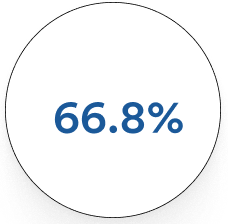
Smarthistory’s bounce rate was 66.8% during this time period. The average bounce rate is between 26% and 70%, with the optimal range being between 26% and 40%.
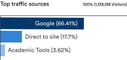
The site had 1.1 million visitors during this time period with the majority of traffic coming from google search. It was surprising for the team and the client that academic tools were 3.62% (36,826 visitors) of traffic!
02
How can we utilize Eye Tracking to better understand user’s navigation behaviors?
Our Eye Tracking Process
What is eye tracking?
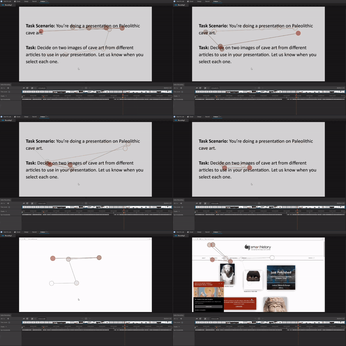
My team used Tobii eye tracking software to conduct the usability testing. Eye tracking technology uses light waves to trace eye movement of the pupil, the darkest part of the eye, as it moves across a webpage.
In traditional usability testing, participants “walk through” tasks aloud as they conduct them. During eye tracking testing, participants are asked to walk through their tasks after they conduct the test to maximize the accuracy of their eye tracking maps. This post-test walk through is called a Retrospective Think Aloud or RTA.
The sessions were broken into 2 segments:
10-15 minute eye calibration and task completion
15 minute Retrospective Think Aloud of the tasks
Our Eye tracking tasks
When recruiting participants we asked them to rate their experience with Art History on a scale of 1 (not at all familiar) to 5 (very familiar).
Our testing participants had a mix of experience and gave a great perspective on what was missing from their use of other Art History resources and teaching methods.
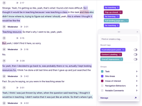
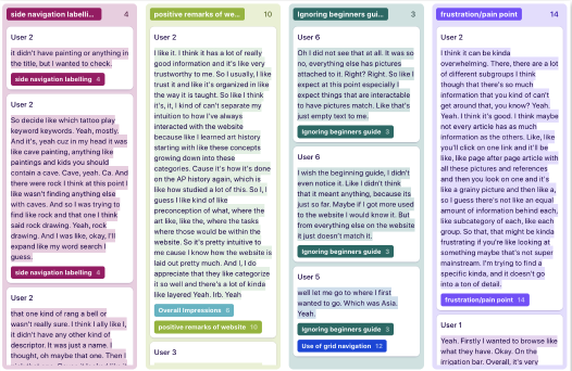
I created a Dovetail project for my team to cross analyze the data through atomic research methods. Atomic Research is '“an approach to managing research knowledge that redefines the atomic unit of a research insight. Instead of reports, slide decks, and dashboards, the new atomic unit of a research insight is a nugget. A nugget is a tagged observation supported by evidence. It’s a single-experience insight about a customer’s experience.“
Participant quotes or actions are tagged so that anyone in the team can analyze information to identify and track patterns that emerge in context of our research objectives.
6 Participants came onsite to complete 30 minute testing sessions.
-
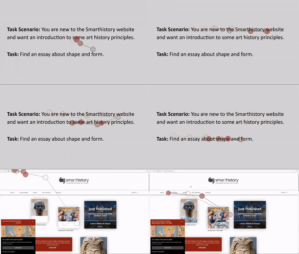
You are new to the Smarthistory website and want an introduction to some art history principles. Find an essay about shape and form.
User type: new to art history that tests Website Areas including: Start Here, Site Navigation and Image block navigation -
Task 2: You’re teaching a session of introduction to Asian Art and want to assign the class a video to watch from Smarthistory. Find a video to show your class about the sacred arts of Tibet.
User type: teacher that tests website areas including: Landing page image blocks, video content -
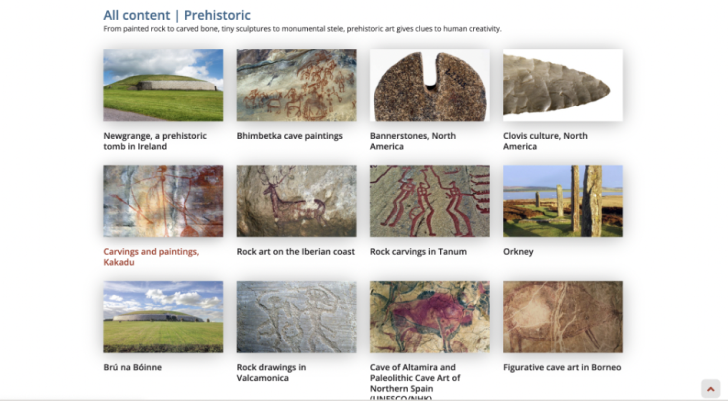
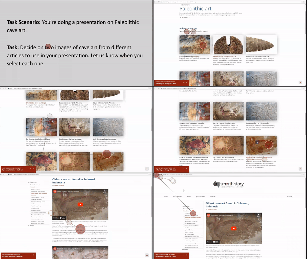
You’re doing a presentation on Paleolithic cave art. Copy three images of cave art from different articles to use in your presentation.
User type: student or teacher that tests website areas including: Landing page image blocks, Content pages, Image content type, Sidebar navigation -
You’ve recently listened to a podcast about Islamic Design and want to learn more. Find an article to read about how mosques are designed and built.
General users
Website areas: Landing page beginner’s guide and content pages
Finding Participants with a diverse knowledge of Art History!
How can we analyze four hours of data across our range of research questions?
Source: https://dovetail.com/blog/atomic-research/
We got transcriptions of each RTA session and had each team member do at least 2 analysis sessions on Dovetail for optimal insight identification
Eye movements were recorded and played back for participants to describe their thought process when completing tasks.
Tasks were presented using the Timeline feature on Tobii which removed the need for participant to speak to the team members while their eyes were tracked
Our Participant Breakdown
A total of 148 highlights were created. By synthesizing these highlights, we gathered 13 usability issues and generated 5 key insights for further design solutions.
2. Taxonomy
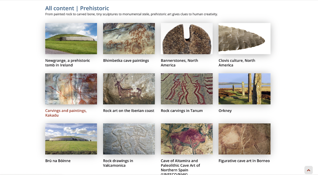
Lack of labelling: Participants found it difficult to find specific types of media during the tasks as content types are not differentiated from the landing pages.
03
Overall findings: there is a disconnect between navigation styles on a website with 4,000 essays and videos and 500 academic contributors
Findings & Recommendations
Navigation
Love of images: Participants used the image navigation to find beginner content more than the beginner’s guides.
Lack of interaction: The left navigation on content pages was used as a reference but not interacted with.
Mismatch of labelling: The image based grids on landing pages are not consistent with the side navigation on content pages causing confusion.
What worked well for our participant group?
“I think it’s like an amazing resource potentially for people. Like it seems really accessible and once you’re into an article you have such a great array of images “
– Participant 5
“I think it’s organized quite well considering the probably a lot of information posted on this site. “
– Participant 3
“Generally I like the layout. The way they use images and layout is very clear. “
– Participant 1
Where did we note room for improvement?
Finding & Recommendation 1: Navigation
People use the image blocks rather than beginner’s guides to find information.
Where did we see this?
“Oh I did not see that at all. Everything else has pictures attached to it. Especially at this point especially I expect things that are interactive to have images.”
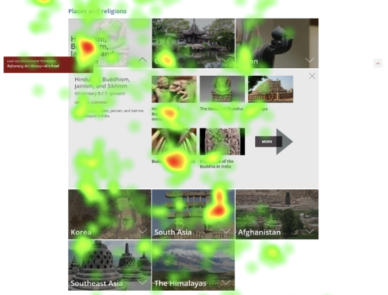
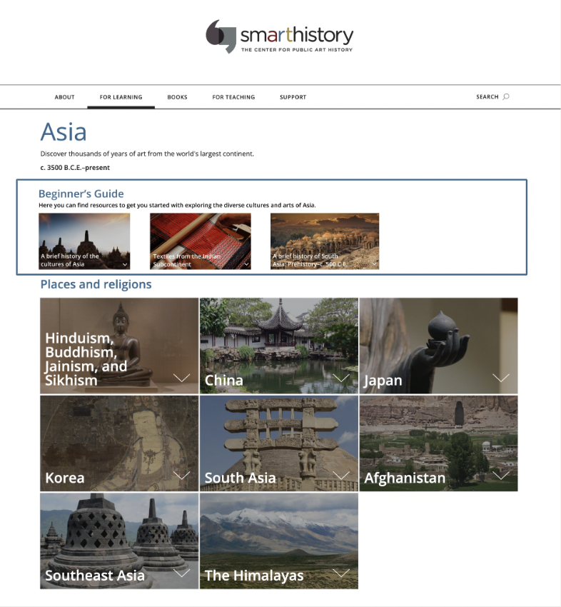
We found that users scanned the beginner’s guide but interacted with the image blocks navigation. Participants found it easy to assess and make decisions on their next click with image navigation. The way information is displayed alongside images allowed users to link what they were looking for with the text navigation. Participant’s scanned the beginners guide but 50% of participants used it.
How could this be improved?
Introduce image to Beginners Guide navigation
BEFORE
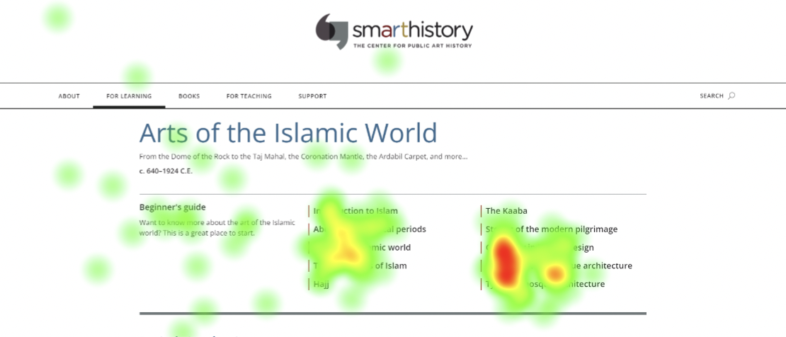
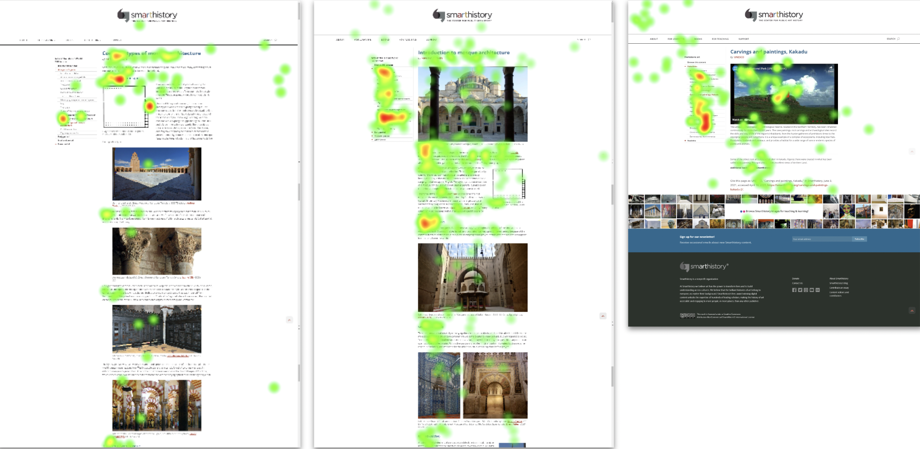
The text based navigation was glazed over while it competed with the image based navigation below.
Heatmap of the Islamic World Beginner’s guide
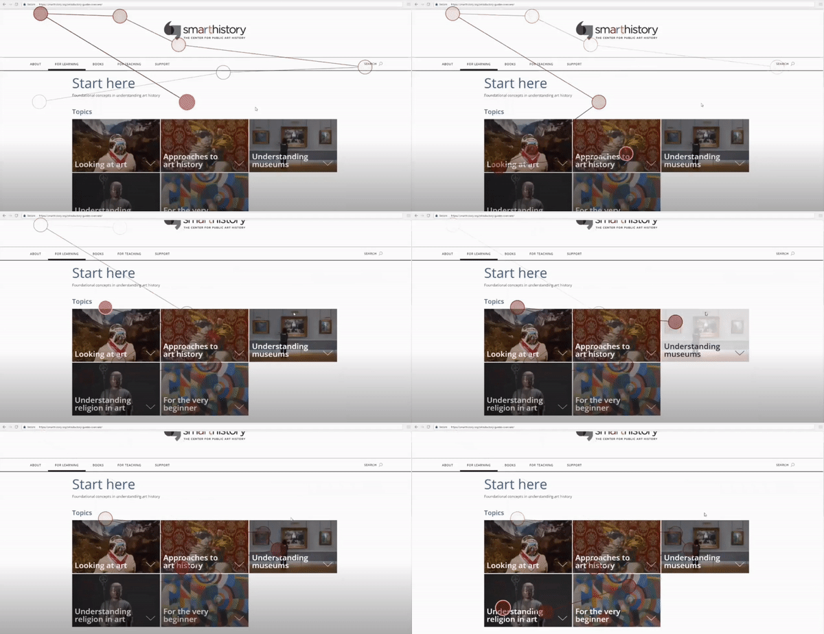
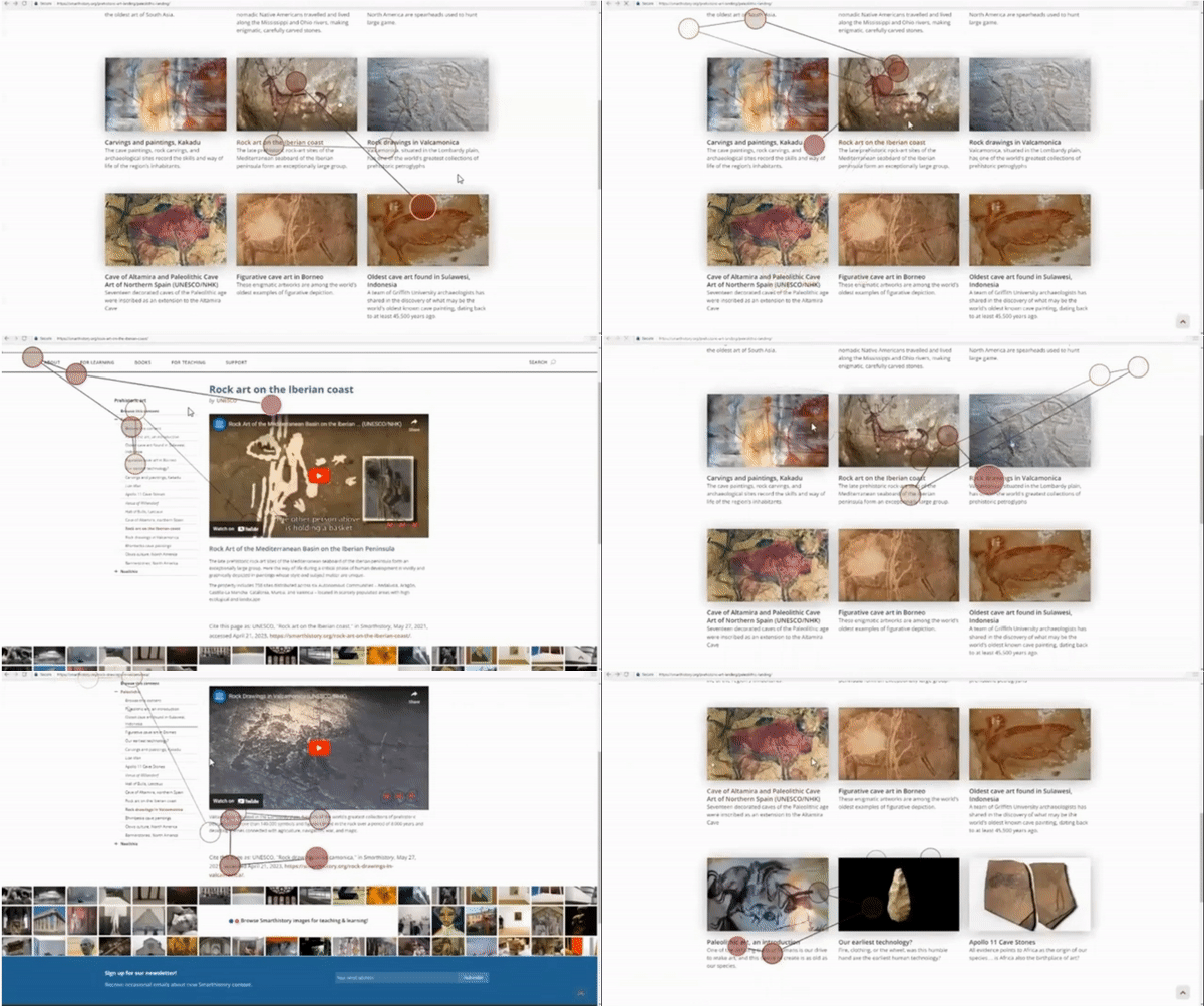
Gaze plot of a participant assessing the image navigation
AFTER
This proposal highlights that the beginners guides are interactive and hold the same utility as the image grid.
Finding & Recommendation 2: Navigation
Users are referencing the left navigation as a way-finding tool.
Where did we see this?
We found that participants try to confirm the accuracy of the content page by cross referencing the navigation but don’t interact with it. When testers didn’t find what they needed in the side navigation they resorted to using the back button to get back to a familiar landing page. In other cases they got frustrated and went straight to the search bar and entered keywords.
How could this be improved?
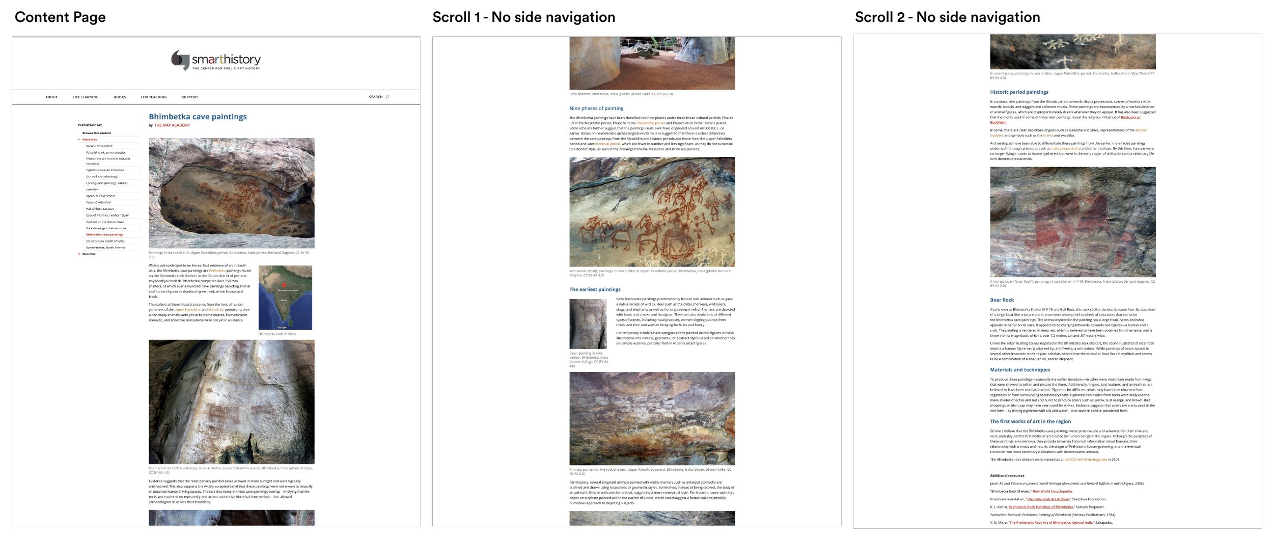
Making the Sidebar Navigation sticky while users browse content
BEFORE
On content pages participant’s focus was grabbed by the sidebar navigation but was not utilized.
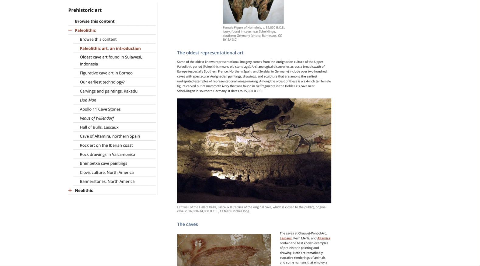
AFTER
The side navigation disappears after one scroll and the user has to scroll back up to remember their location and title of the content on the site.
We recommend bringing this navigation closer to the lower areas of content to keep users browsing similar content.
Finding & Recommendation 3: Navigation
The image grid navigation does not provide a consistent experience across the site.
Where did we see this?
“I think one thing that I was confused about was when I clicked on one of these (image grids), I went in and… I look at the sidebar… it doesn’t match up to the order that I’m seeing here (image grid)... So I just got confused and I don’t know if that is the same as what I saw before.”
How could this be improved?
Consistent Order across landing and content navigation
BEFORE
Gaze plots of a participant realizing the navigation styles are mismatched
AFTER
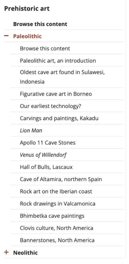
The titles on the content pages do not reflect the sidebar navigation that users see when they enter the article page.
We recommend to order the landing page content in the same order as the sidebar navigation to maintain consistency across the site and provide users with a constant idea of where there are within Smarthistory.
Finding & Recommendation 4: Taxonomy
The absence of content labels and filtering caused the search results to be confusing for users.
Where did we see this?
“I just couldn’t find because it’s from two different essays. So then I just kept collecting one that were videos. So maybe if it like tells you before you go in what kind of media it is, and then I might have been able to find it faster. But here I was just scanning cause I thought I could pick my favorite.”
Participant 3, Task 3 “Finding Images from two different articles”
How could this be improved?
3. Include a filter bar to narrow down the content by its object type, media and area it is from
BEFORE
Gazeplot replay from Participant 3 during task 3 finding images
AFTER
Include content type labels on landing pages so users can find specific assets
BEFORE
AFTER
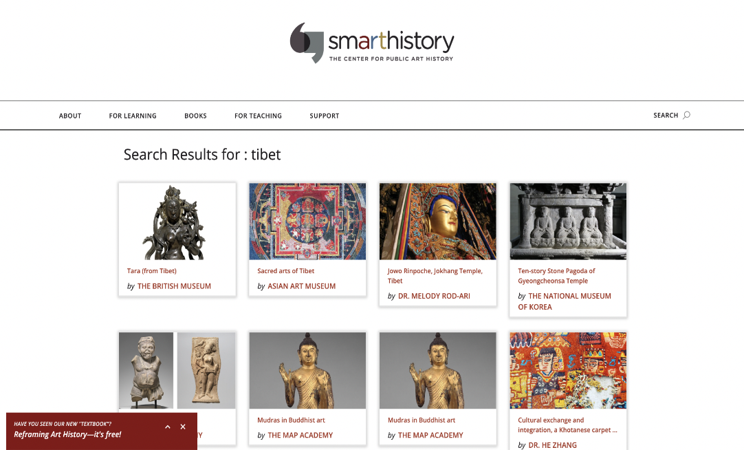
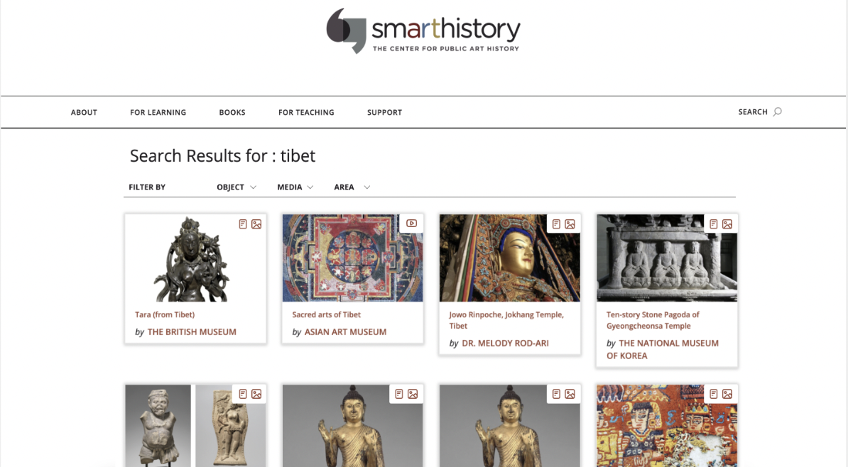
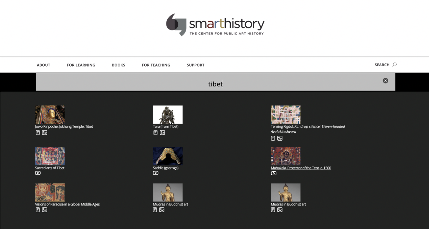
2. Include the content type icons on the keyword search results
BEFORE
AFTER
Each content piece has a label and image but no indication of what is expected within the page.
We recommend to include text titles to state whether the piece is an article, video or has images to improve student and teacher experiences sourcing content.
When a user searches a keyword the results have no labels or indications of what they will be accessing. This lead to frustration during our testing session as participants were guessing where they could find images.
We recommend to include icons to help users identify articles, videos and images when they do a quick search.
The search results had no content identification or change from the quick search results which added another step to the user journey that didn’t add value or improve the access to content.
By adding a filter option users can be super specific about what they are looking for while also being able to view the range of different content available to them.
What did Smarthistory think?
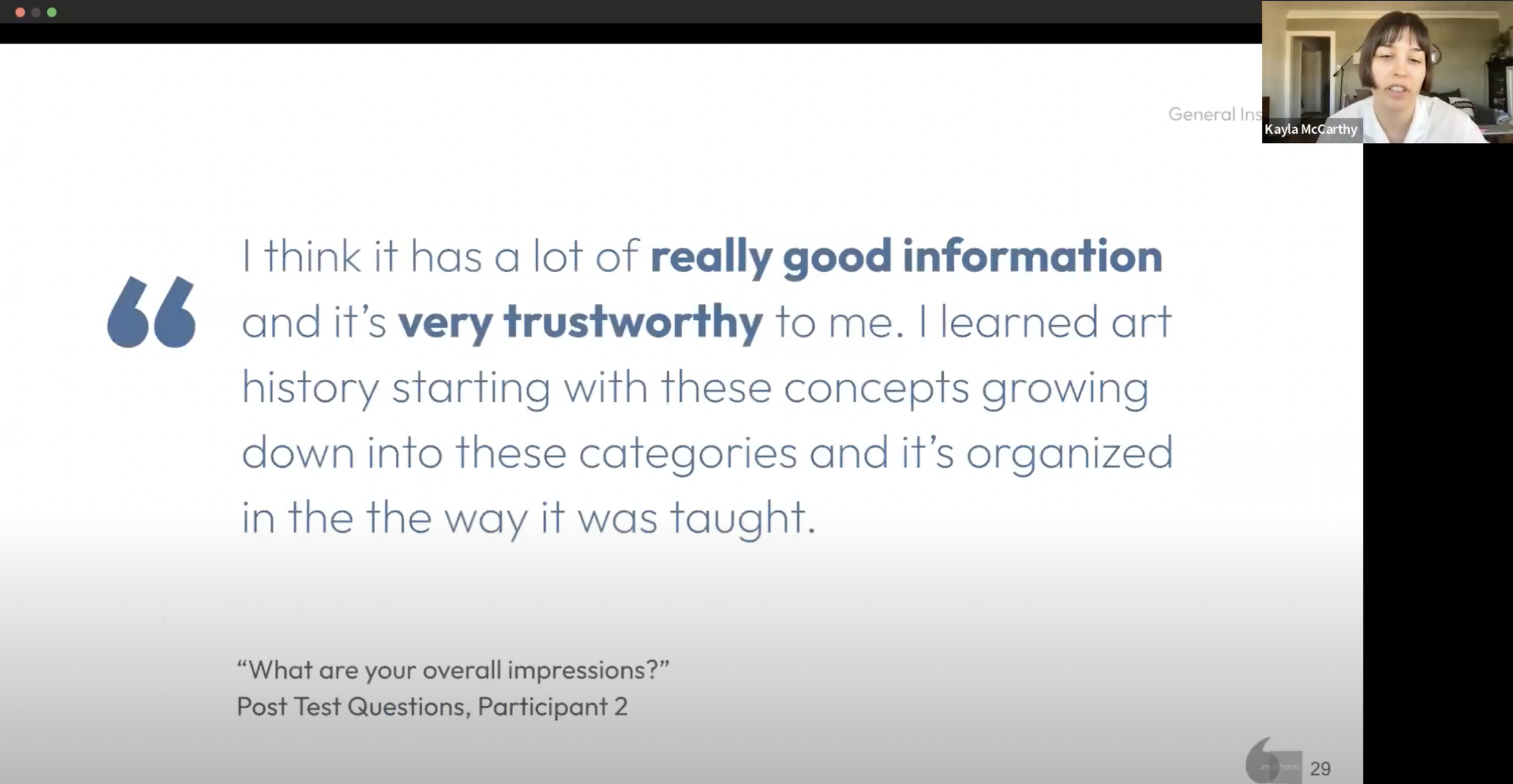
It would have taken me as like the sole like UX person on our internal team like much longer, for to to do without all of your great ideas and and work over the semester. So I just want to say a huge thank you to everyone for all of your hard work and putting together these insights that we're communicated so well. It strikes me that the presentations today have been really synthesized in a way that is is helpful. And the communication and storytelling of the insights was was really really helpful today. So thank you very much.
- Kayla McCarthy, UX Lead and Project Strategist @ Smarthistory
Personal Reflection
It was incredibly interesting to follow through from behavioral data on Google Analytics and Hotjar all the way to testing in person.
It can be really difficult to narrow down on key insights from participant recordings as there is so much happening between Gaze plots, heat maps, participants comments and what they actually do on screen. Becoming selective about what to tell in the story is so important!
04
Engaging Smarthistory with our insights and ideas for improvement
Client Presentation
Thank you for looking through my work!
More projects are right here >>


